Your warehouse data, your dashboard: how StoreFeeder's new AI reporting tools put real intelligence in your hands
June 25, 2026
Most operations have a wealth of data but still make their biggest decisions based on instinct. When to reorder, what to discount and which lines to drop. The data exists: every order, pick, stock movement and channel sale is in the system, but the hard part is getting to the data that matters, in the shape you need and at the moment you need it.
Fixed reports have never solved these issues. As Brian Williamson put it at StoreFeeder Sessions 2026, we have built reports for customers before, added a field on request, then taken a call the next week asking why that field is there. One report cannot suit everyone, and the moment you have run it, it’s already out of date.
In the StoreFeeder Sessions afternoon session, Brian and Shaun Field showed a different approach. This post walks through the new reporting and dashboard tools they demonstrated, what each one does, who it is for, and why it changes how you work with your own data.
As you read on, keep in mind that most of what follows was previewed at Sessions rather than switched on that day. These tools are rolling out through our Early Access Programme over the coming weeks and months, so treat this as a look at what is coming rather than a set of features to go and use today. We’ll flag each one as it goes live, here on the blog and in your usual StoreFeeder updates, so keep an eye out.
Reports you save once, that come to you
Start with the simplest change. Insights reports already cover most areas of StoreFeeder, and the new saved reports feature will let you keep any report with its filters applied. In the demo, Shaun set up a top-selling products report filtered to the London warehouse, saved it, and named it so it would be ready to run again whenever he wanted.
You can share a saved report with the team, and StoreFeeder respects each person's warehouse and channel permissions when it does, so nobody sees data they shouldn’t. From there, you can schedule it to arrive at 9 am every day by email or as a message in the app, with FTP delivery coming. A full audit history shows who changed what, and an export history captures the data each time it runs, so you can pull up last week's version and compare. Reports are also available through the REST API, if you want to feed StoreFeeder figures into your own systems.
Saved and scheduled reports and Power BI access come with your standard account.
A live copy of your data you can plug into anything
For businesses that want to go further, we built the Reporting DB, which answers one of the most common requests we get: a connection string to your own data.
The Reporting DB is a shadow copy of your account database, flattened into a structure built for reporting and kept closely in sync with what is happening live. It carries no personal data and is restricted to admin users. Plug it into Power BI, which ships with a sample file to get you started (or into whatever tool your team already uses), and run any query you like: brand metrics, dead stock, or inventory value without ever touching or slowing your live operational system. A handful of customers are already running on it, and the feedback has been that being able to shape their own data has changed how they make decisions.
The Reporting DB and custom dashboards sit within the Insights Pro package.
Dashboards that show the day as it happens
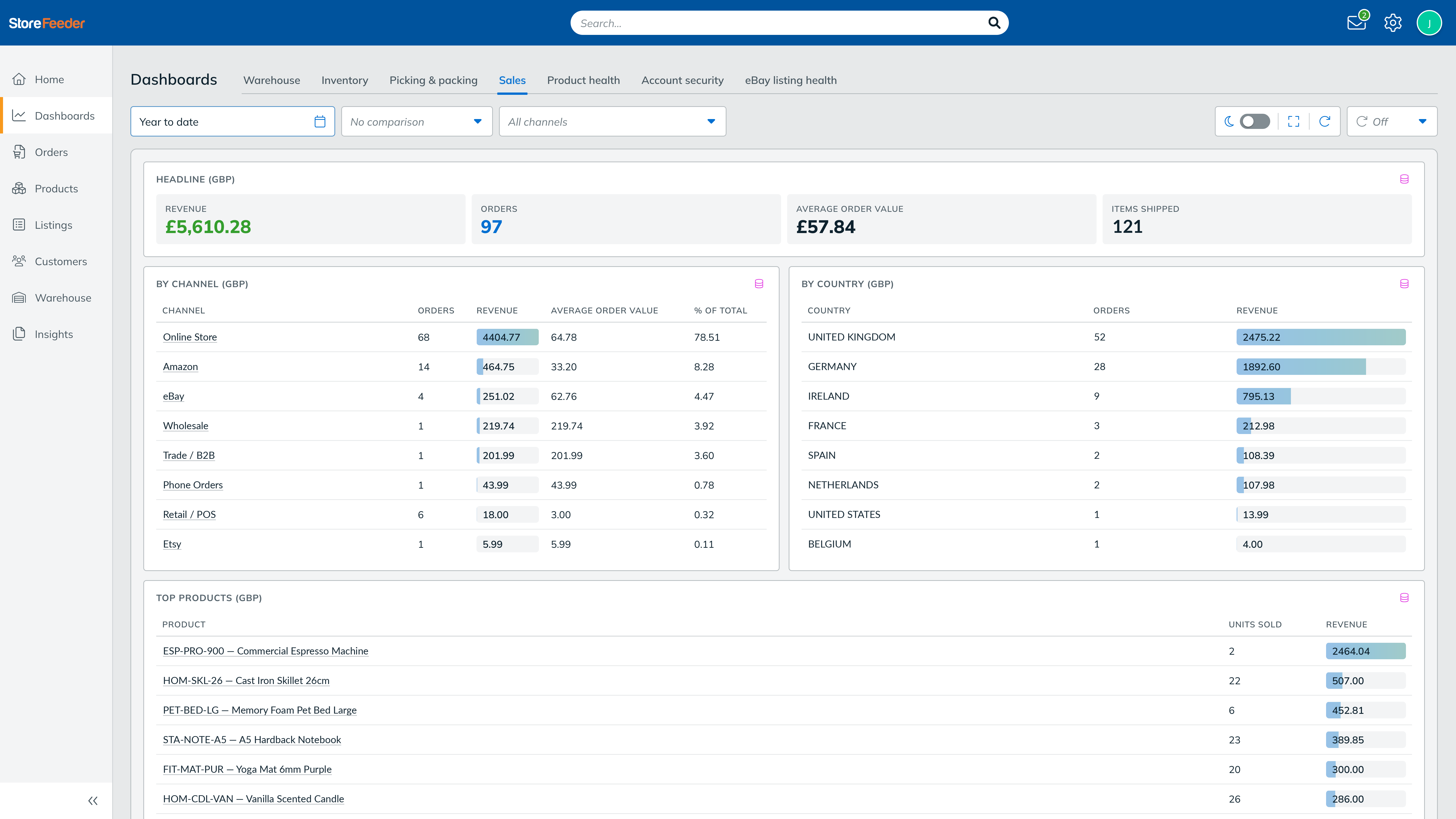
StoreFeeder now offers a set of dashboards out of the box. On stage, Shaun walked through the warehouse view, and it gives you a sense of how much one screen now holds.
- Warehouse: open and queued pickwaves, who is picking, items remaining, and a live cut-off section. If Amazon Buy Shipping closes at 5 pm and 13 orders are at risk of missing it, you see that and click straight through to the orders that need processing. Pickwave progress shows each wave's status, down to a packer finishing 32 of 62 orders with an expected completion time.
- Inventory: active, slow-moving and dead stock at a glance, high-selling lines that have run out and are worth reordering, items running low on days of cover and a clear flag for stock that is losing you money.
- Sales: revenue and orders so far today, the countries buying, your top products, a daily trend you can stretch across any range and a comparison against any prior period.
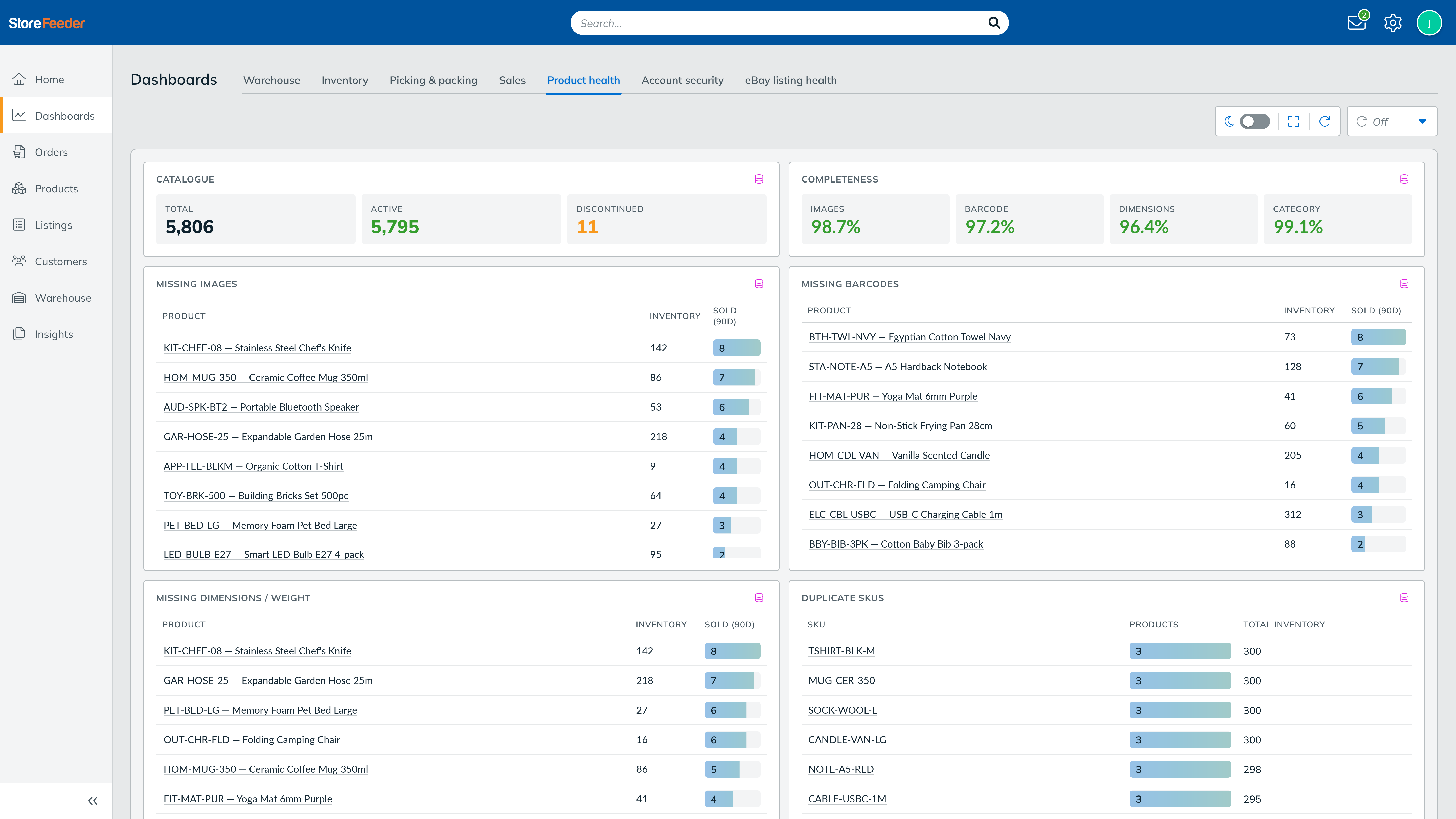
- Product and listing health: products missing dimensions, images, barcodes, or with duplicate SKUs, plus an eBay view showing which item specifics are missing. If most of your listings lack a brand, that’s what you should fix, and the dashboard shows you that.
Standard accounts come with these pre-built dashboards. Insights Pro is required for custom dashboards, tailored specifically to the unique data requirements of your business.
The AI dashboard builder: describe it and it appears
The AI dashboard builder was the part of the session that really got the room's attention.
The dashboard builder lets you describe the view you want in plain English, and it builds it for you, drawing on the Reporting DB. Shaun took a request from the floor: someone asked for "sales by channel, by country", and a working dashboard built itself on screen with Amazon at the top and GB revenue over the last 30 days. He then added "the top 10 SKUs" to the same view in another line. You keep adding as you go, build as many as you like, and if you don’t like where the AI has put something, you can simply move it and resize it yourself.
That is the shift worth sitting with. For years, the questions you could ask your software were limited to the reports someone had already built. Now the question itself is the starting point, in your own words, and the dashboard surfaces the signals that drive decisions: profitability, cash tied up in stock, operational lag and channel margins, in plain terms rather than rows of raw numbers. The builder is part of Insights Pro since it relies on the Reporting DB to run those queries safely.
Put it on the warehouse wall: kiosk mode
A dashboard is more useful when the whole team can see it. Kiosk mode puts a dashboard full-screen (on a monitor) on the warehouse floor and auto-refreshes it every 30 seconds, every minute, every five minutes, or whatever suits the shift. We built it after seeing how many warehouses were rigging their dashboards up the awkward way, and we wanted to hand that over properly. The cut-off timers and pickwave progress that pair with Scheduled Pickwaves are exactly the kind of thing worth having live in front of the team all day.
What comes next: dashboards that watch themselves
Picture an agent watching your dashboards around the clock and messaging you via WhatsApp, Slack or email the moment something looks off, a margin has slipped, or stock has run dry. Some customers are already doing a version of this, running it on a Mac mini that works for them 24/7.
Ian Dade talked about the operational maturity curve earlier in the day, and this is the next rung: an AI maturity curve where useful things happen for your benefit without you going to look for it. You remain in control and make the decision, but you spend less time hunting for the thing that needs your attention.
Reports for everyone, deeper access when you want it
It would be easy to file all of this under 'better reporting', but that would undersell it. Instead of working around the reports you happen to have, you ask the question you actually have and get an answer, and the numbers come to you rather than waiting to be pulled.
Saved reports, scheduled reports, Power BI access and the standard dashboards come with your account. The Reporting DB, custom dashboards and the AI builder sit in Insights Pro for teams that want to go deeper.
For what is live now, what is in Early Access and which package each feature sits in, see our post on when the new StoreFeeder features will be available and, for the full run of the day, our Sessions 2026 recap.
